Available on all plans
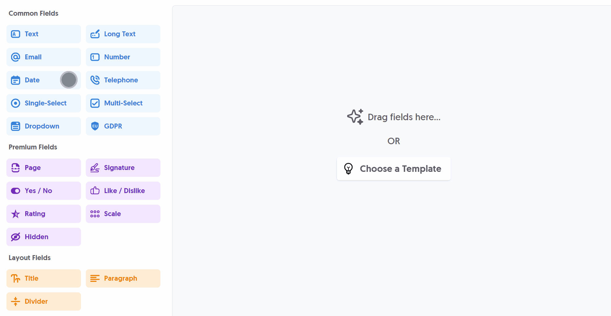
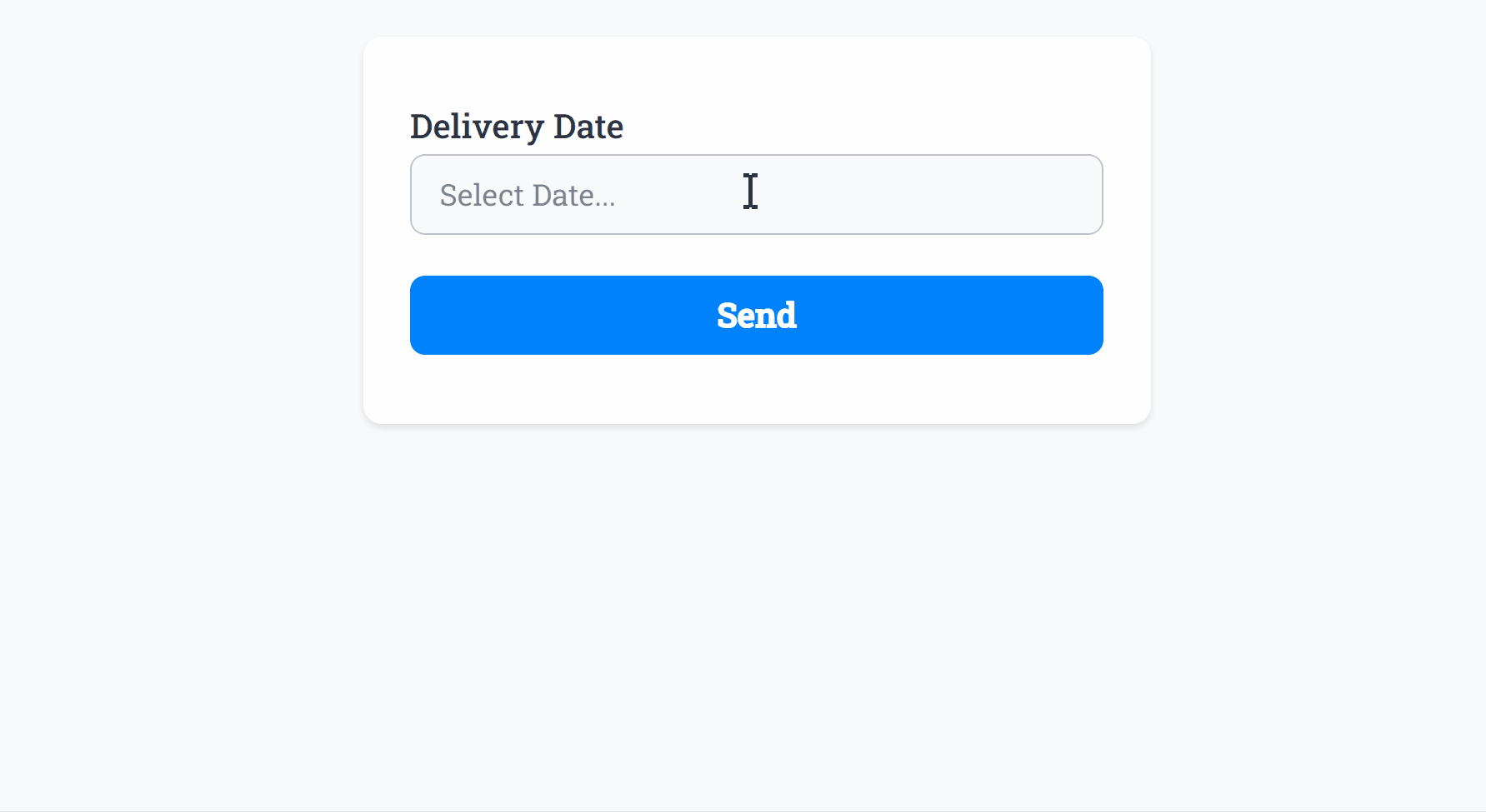
Use the Date field to present the user with an elegant datepicker, with a Date Format of your choice.
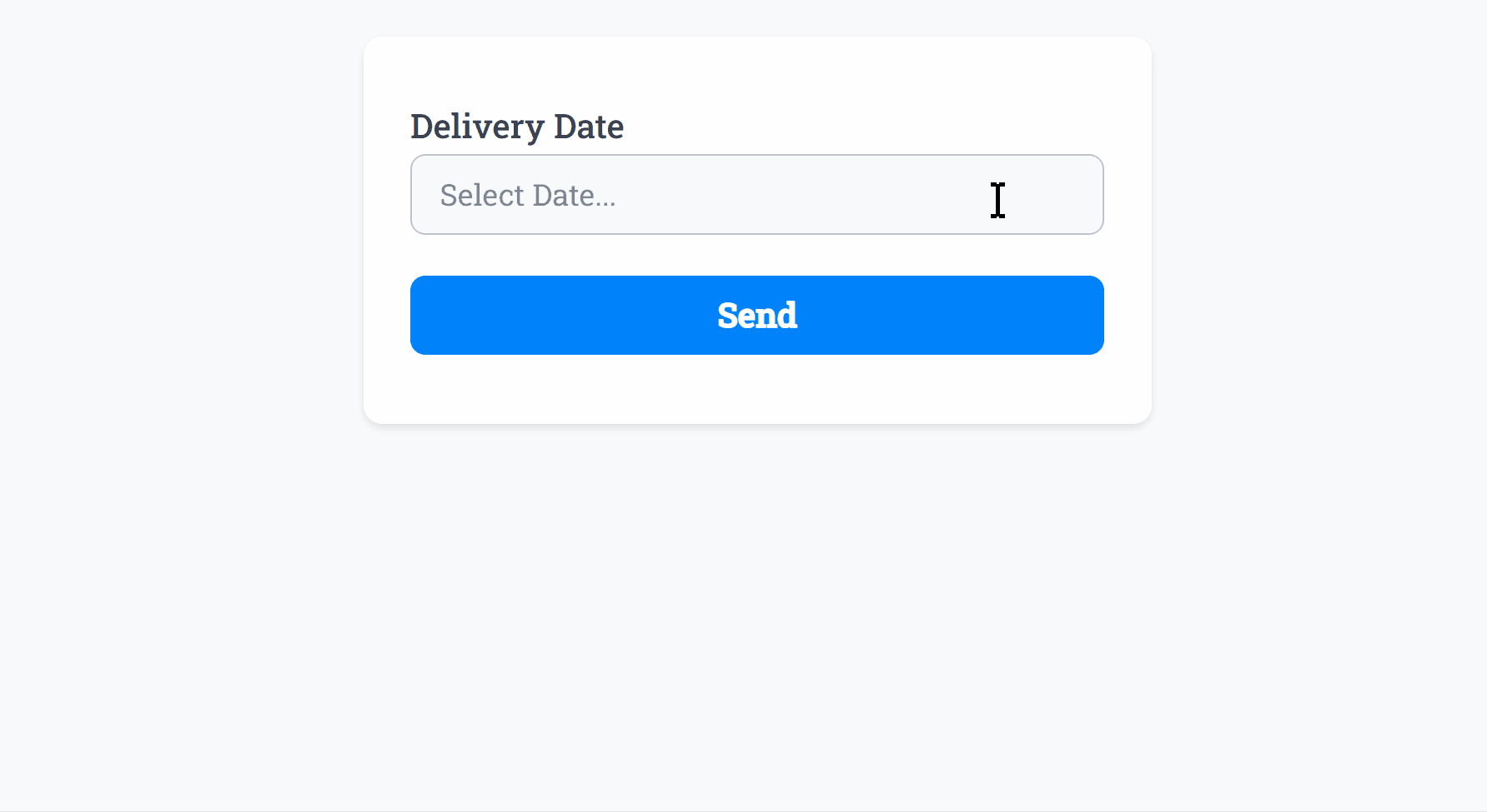
After adding the Date field and making any tweaks, you can press Live Preview or Publish to test it out:
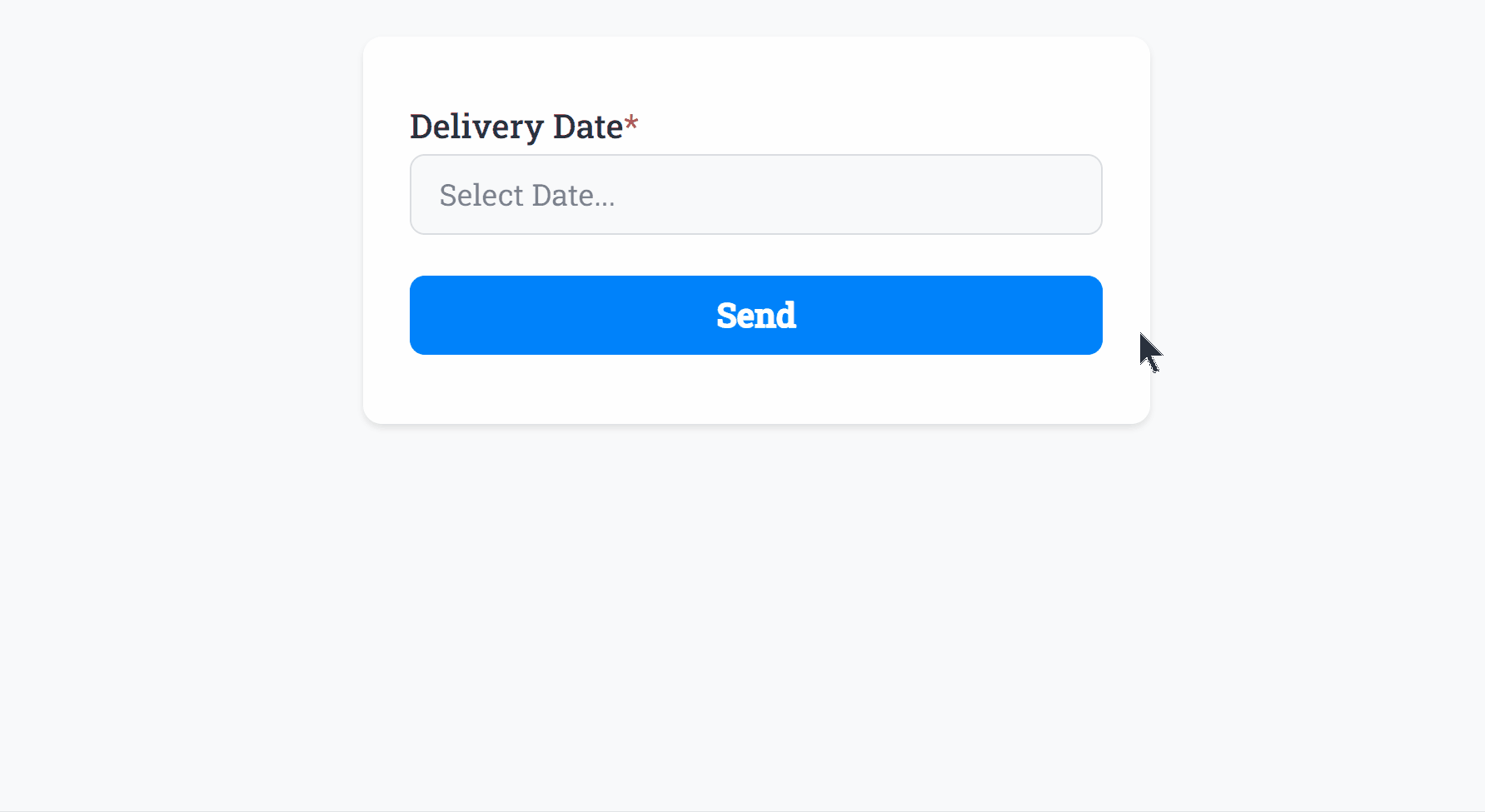
Optionally, you can add Required Smart Validation to ensure the field is always filled out:
The Date field supports Min Date and Max Date values as demonstrated (min date set to 6th June 2024 and max date set to 13th June 2024) to prevent selection of any dates before or after certain periods. Both Min Date and Max Date can be used independently as well.
You can also toggle the convenient Enable/Disable Days feature to allow only specific days of the week to be selected (for example disabling weekend selection):
Further options include a Disabled Dates custom list where you can manually enter dates such as 2024-01-01, 2024-01-02 to be excluded from possible selection.
The Date field background, selected date, border and text color can be changed within your Theme settings.
Specific Options
Configuration options specific to this field:
Date Format | Select a visual date format for the form field |
Min Date | Set a minimum date that can be selected in the past |
Max Date | Set a maximum date that can be selected in the future |
Enable/Disable Days | Allow only specific days of the week to be selected |
Disable Dates | A comma-separated list of dates to exclude from the date selector |
Common Options
Available on most fields, including this one:
Label | A short description of the field |
Description | An optional longer description of the field |
Required | Enforces the field to be filled in, displays an error if not |
Default Value | Set a default value for the field |
Placeholder | A helpful hint inside the field, e.g. Enter your name |
Read-Only | Locks a field so it cannot be edited, useful when combined with Default Value |
Custom Name | Every field has a unique hidden "name" that can be customized for plugin integrations |
Create incredible forms to run your business.
Join companies of all sizes using Form Falcon to manage their business, generate more sales and power custom workflows.
Try It Free
Free 30-day trial, no credit card required.