Available on all plans
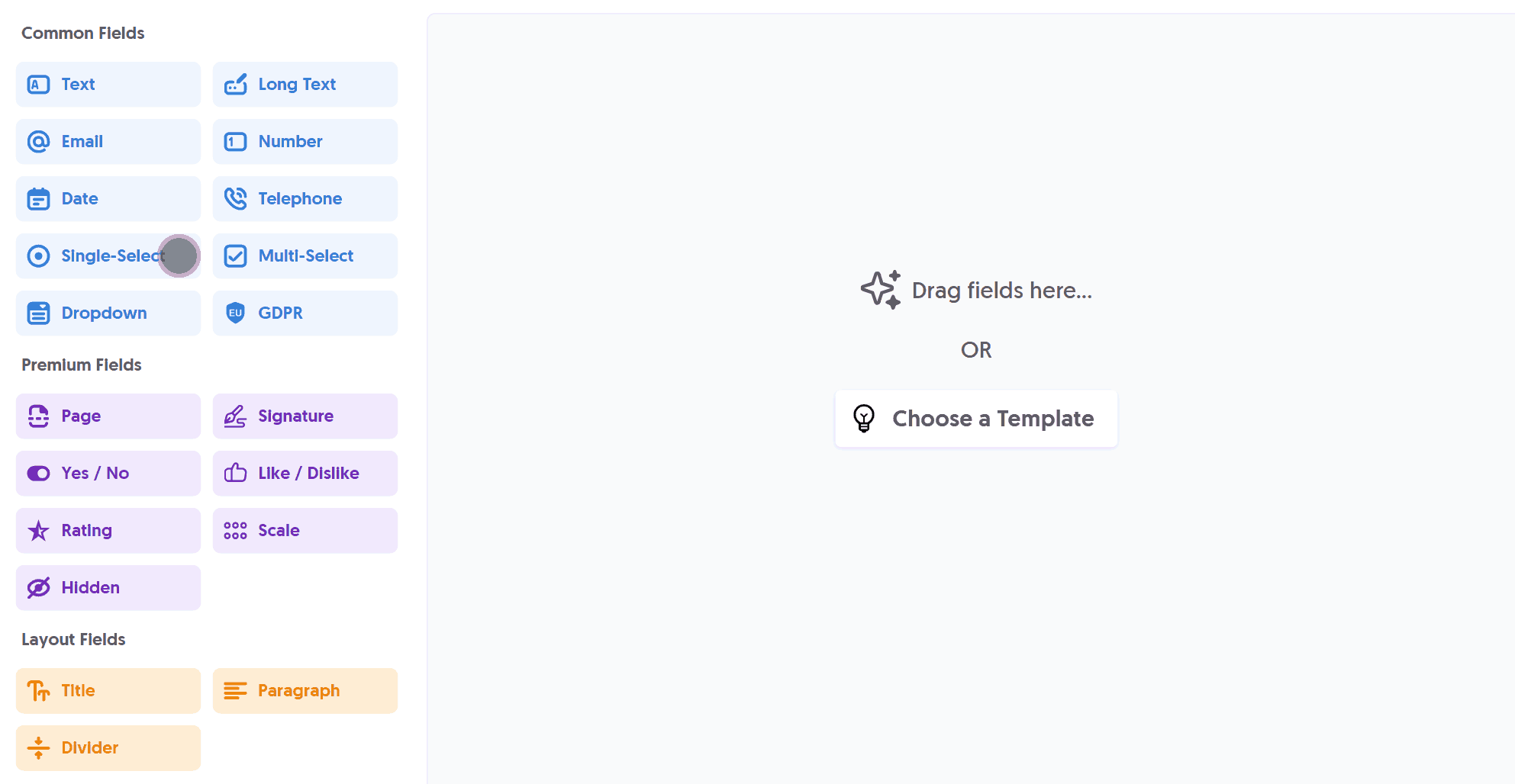
Use the Single-Select field to present the user with a list of options, allowing them to select a single choice only.
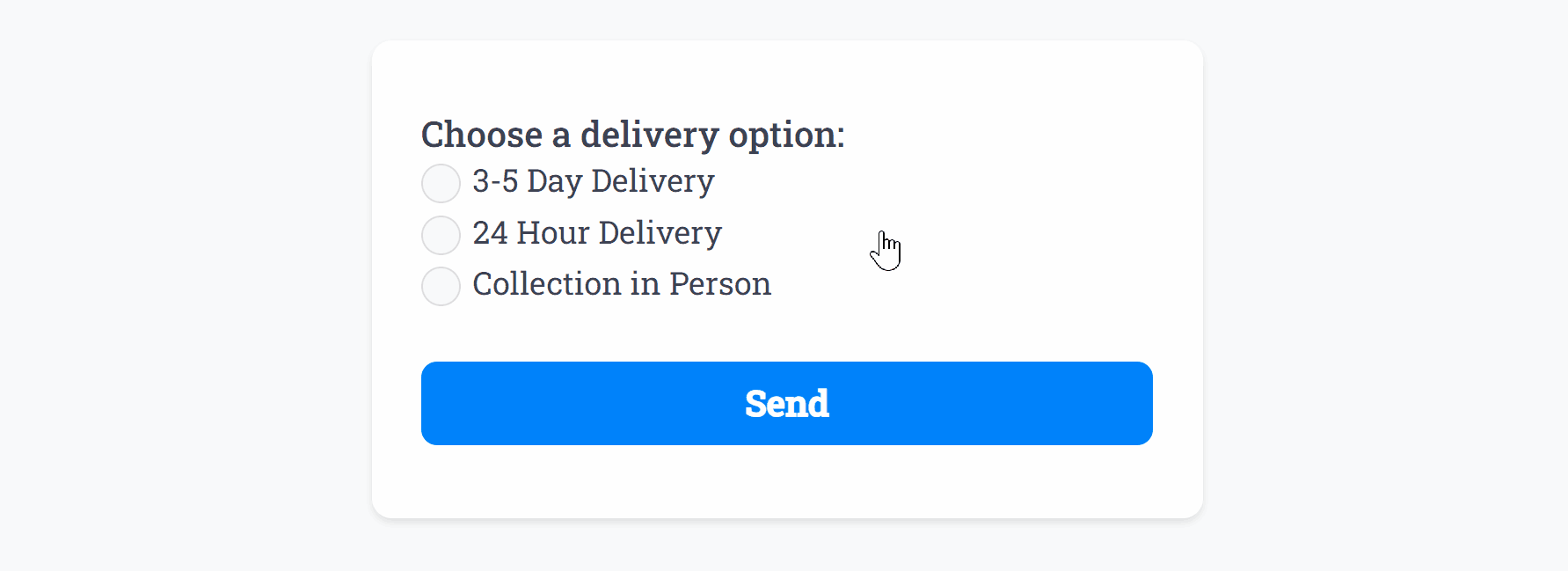
After adding the Single-Select field and making any tweaks, you can press Live Preview or Publish to test it out:
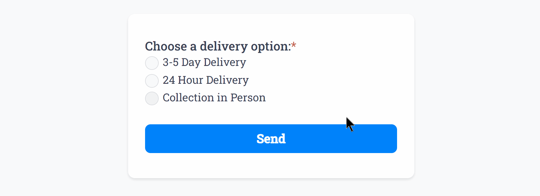
Optionally, you can add Required Smart Validation to ensure the field is always filled out:
The Single-Select field also supports a Direction option to stack your choices vertically or horizontally.
Single-Selectsupports one of our top features: Email Routing, which automatically routes form responses to different email addresses based on user selection.
Specific Options
Configuration options specific to this field:
Email Routing | Automatically route form responses to additional email addresses with tailored email delivery. |
Options List | Specify a list of options the user can choose from |
Direction | Stack the options horizontally or vertically in the form |
Common Options
Available on most fields, including this one:
Label | A short description of the field |
Description | An optional longer description of the field |
Required | Enforces the field to be filled in, displays an error if not |
Default Value | Set a default value for the field |
Read-Only | Locks a field so it cannot be edited, useful when combined with Default Value |
Custom Name | Every field has a unique hidden "name" that can be customized for plugin integrations |
Create incredible forms to run your business.
Join companies of all sizes using Form Falcon to manage their business, generate more sales and power custom workflows.
Try It Free
Free 30-day trial, no credit card required.