Available on all plans
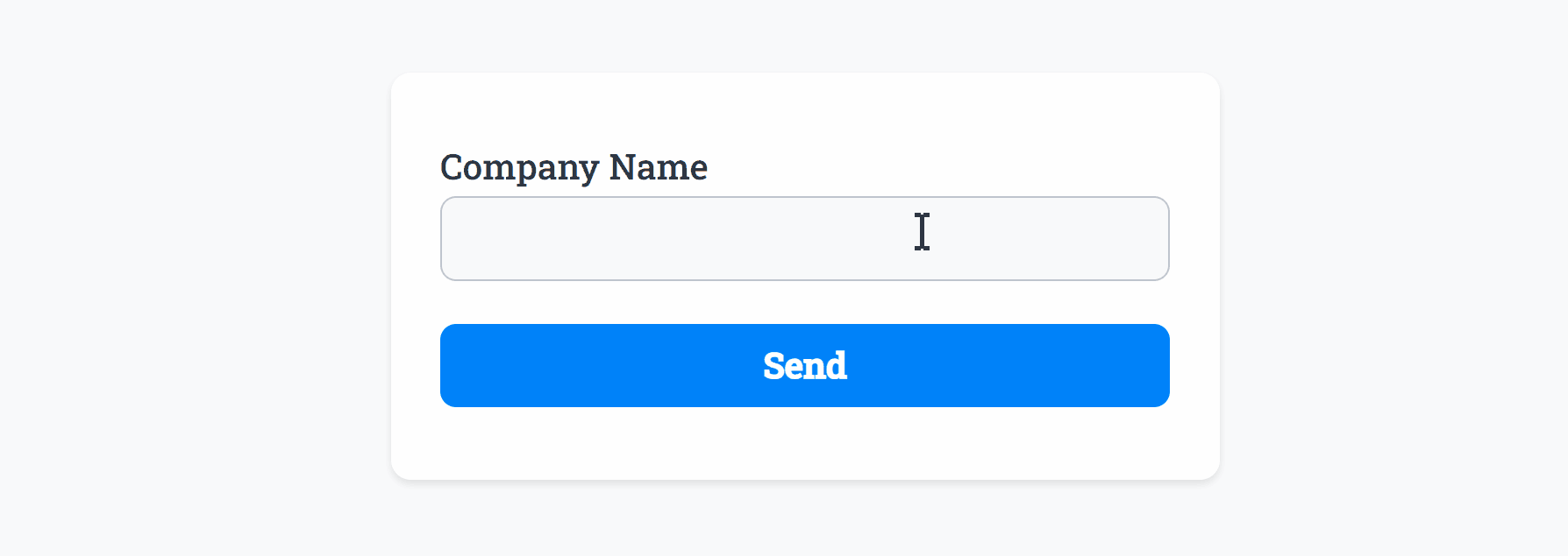
Use the standard Text field for simple text answers, for example a Company Name or anything you need.
After adding the Text field and making any tweaks, you can press Live Preview or Publish to test it out:
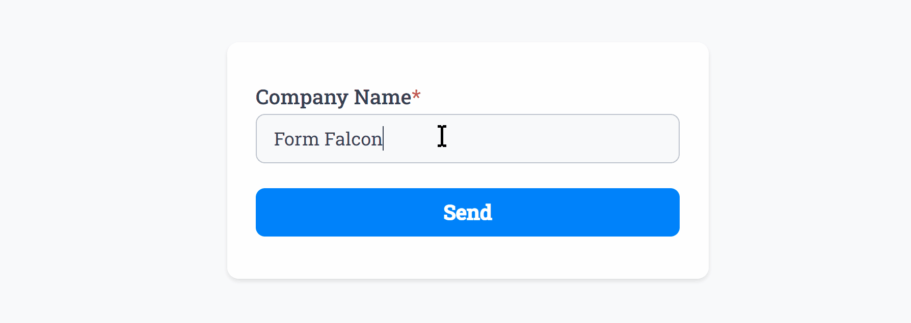
Optionally, you can add Required Smart Validation to ensure the field is always filled out:
The Text field also supports Min Length and Max Length input validation, to enforce or limit character counts:
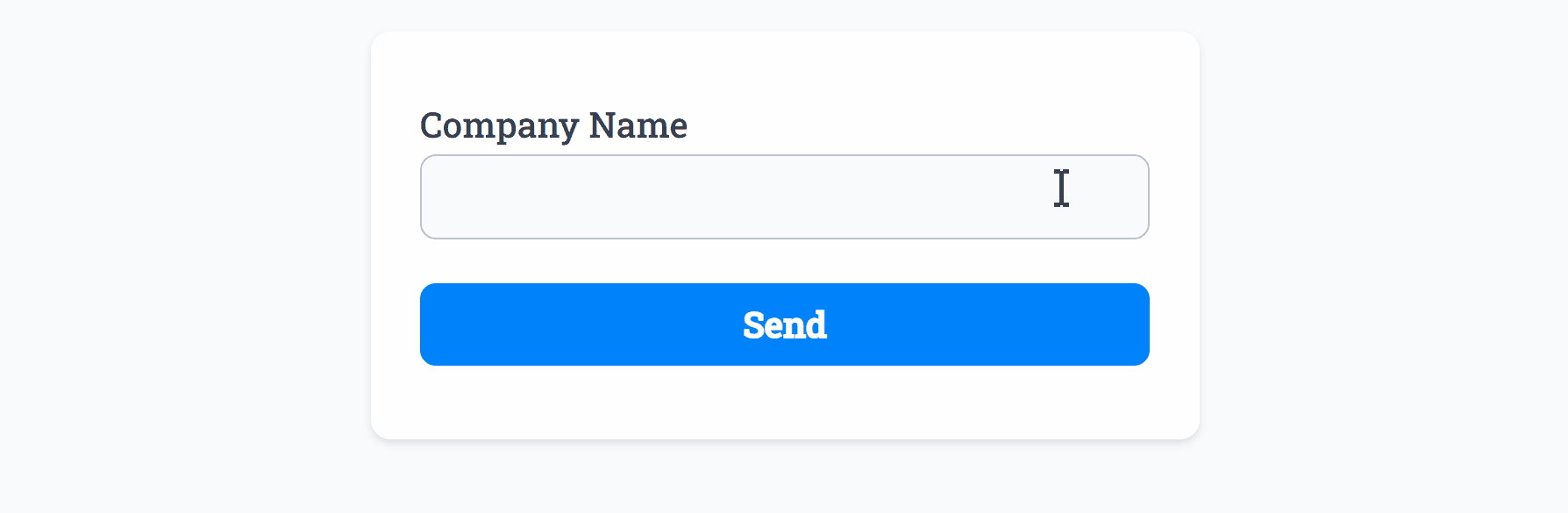 Min Length set to ‘2’ and Max Length set to ‘11’
Common Options
Available on most fields, including this one:
Label | A short description of the field |
Description | An optional longer description of the field |
Required | Enforces the field to be filled in, displays an error if not |
Default Value | Set a default value for the field |
Placeholder | A helpful hint inside the field, e.g. Enter your name |
Read-Only | Locks a field so it cannot be edited, useful when combined with Default Value |
Min Length | Enforces a minimum character count for this field. |
Max Length | Enforces a maximum character count for this field. |
Custom Name | Every field has a unique hidden "name" that can be customized for plugin integrations |
Create incredible forms to run your business.
Join companies of all sizes using Form Falcon to manage their business, generate more sales and power custom workflows.
Try It Free
Free 30-day trial, no credit card required.